Tuesday, July 29, 2014

LOTV - It's a Christmas Blog Hop!

Good morning, everyone. Things have been a little too quiet here on my blog, but rest assured, work is going on behind the scenes and new projects to share are happening!

Today's the day for Lili of the Valley's Christmas blog hop to celebrate the launch of wonderful new Christmas products. This is a big release - 22 new character stamps - vintage boys & girls, snowmen, penguins, and angels;  4 new beautiful Christmas paper pads; new clear Christmas sentiments; clear Christmas carols and recipe stamps; and some new mini images. Sharpen up that list-making pencil - I have a strong feeling you're going to need it! :)

The new stamps and papers will be available on the LOTV website starting at midnight Friday, August 1 (UK time) (that's late afternoon Thursday for most of us in the US, except for Hawaii where it's earlier in the afternoon LOL).

As before with the hops, there are fabulous prizes up for grabs, with winners to be drawn at random from the comments of the participating blogs. Even we don't know whose blogs are the "lucky" ones, so to increase your chances of winning in the drawing from comments, hop from one blog to the next and leave a comment on each one!

This time there's one prize drawing for the 12 angel, penguin, and snowmen stamps. The second drawing is for the 10 vintage children stamps. Both winners will be drawn at random from all the comments left on the lucky blogs, and winners will be announced Thursday evening on the Ideas To Inspire blog.

Here's a linked list of all the blogs taking part...

Kathy (you're here!)
Lou

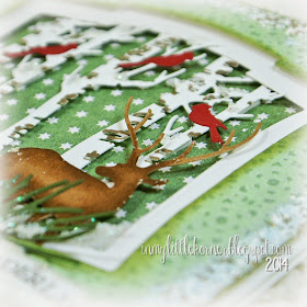
And here's my card. I used patterned papers from the new Festive Trimmings paper pad, and one of the sentiments from the new clear Christmas wishes sentiment sheet, along with lots of fun holiday dies for a frosty winter scene:


In the corner, a large die cut poinsettia, sprinkled with clear coarse glitter and with tiny bells to simulate the yellow stamen center...


The new LOTV Christmas sentiment stamp is in a straight line on the stamp sheet, but one of the reasons I love clear sentiment stamps is the versatility of being able to shape them the way you want. I "waved" this one on the stamp block, and stamped it onto a tattered banner die cut (that I tattered just a bit more and edged with clear glitter)...


I used lots of foam tape for dimension on this card...the green star Festive Trimmings paper is the only one adhered directly to the card front. The white frame layer is popped up from the green star paper, the trees are adhered with foam tape, the deer and the green dotted Festive Trimmings paper are popped up from the white frame, and finally the banner is popped up from the green frame paper. It all forms natural shadows and interest to the overall scene...


Supplies:
Patterned papers:  LOTV *new* Festive Trimmings
Sentiment stamp:   LOTV *new* A5 Christmas Wishes clear stamp
Dies:   Spellbinders Labels Two and Layered Poinsettia;   Impression Obsession Birch Trees,
Deer Trio, and Pine Branch;   Tim Holtz Tattered Banners
Twine:   The Twinery / Red Shimmer      
Miscellaneous:   Glistening Snow-Tex;   Shabby Blue Frantage embossing powder


Your next stop is Crafty Lou's blog to see the beauty she has for you.  And don't forget to stop by the Ideas to Inspire blog Thursday to see if you're one of the lucky winners of the two prizes.

Enjoy the hop, and good luck everyone!


Monday, July 21, 2014

LOTV - We Are All Special...

Happy Monday, everyone! I'm starting this week off with the "twin" to last week's LOTV card. Both are watercolored roses, both done in pretty much the same colors, but with just a slight twist to make them individual in nature. Today's card uses the single rose from Set 66, Grunge Elements (along with just the top of the leafy branch in the same set) and pairs it with one of the quotes from  Inspirational Sentiments ...


I used patterned papers from several different LOTV paper pads...the black dot is from Father Knows Best, the green solid from Pressed in Time, and the pretty pink is from Heartfelt.

Here are a few detail shots around the front...


The small sentiment stamped and embossed onto a strip of vellum over the crocheted lace is from LOTV's Set 25, Handwritten Phrases ...


Supplies:
Patterned papers:   LOTV Father Knows Best, Pressed in Time, and Heartfelt
Stamps:   LOTV Set 66/Grunge Elements,  Set 25/Handwritten Phrases,  and Inspirational Sentiments
Flowers:   Wild Orchid Crafts           Pink stamens:   ChocolateLetters on Etsy
Die:   Sizzix Flowers Branches & Leaves            Pearls:   Recollections            Crocheted Lace:   local craft store
Miscellaneous:   Sakura Koi watercolors, twine, clear embossing powder, vellum


Thanks so much for visiting today...I hope your week is starting with a smile!


Thursday, July 17, 2014

Bliss...

Good morning, all! Things are moving a little slowly here in the craftroom this week...well, at least things I can post right now. I'm working on a few projects for posting at later dates, trying to get ahead of when they're due so I'm not scrambling at the end. I'm not happy when I have to create under pressure, and I think it shows in the finished project, so I do my best not to put myself in that position. :)

Today's project is this week's mixed-media-meets-shabby-chic card (I'm loving the process of making these, so there may be one weekly from now on!). Once again, I used Spectra Bleeding Art tissues to color the background, but this time, I covered the whole piece with a light coating of gesso after the tissues dried, which left me with a beautiful, soft, pastel background. That way, I could use inks and stamps in places where I wanted bolder colors.

Another technique I added this time was to mix Perfect Pearls powder with translucent embossing paste. I applied this using the chevron stencil. In trying to get a closeup for you to see the slight sheen this added, I realized the best photo of it was the full-on photo of the card. If you click on the card pic to enlarge it, you can see the shimmer it adds...it really dresses up the card!

And that's what led me to make all the embellishments monochromatic - all in cream, and very feminine, starting with the large lace rose in the center...


The die cut beneath the flowers in the upper left corner is cut from black cardstock...I dry-brushed it with gesso to lighten it just a bit, but still keep it from blending into the background too much...


I used Aquamarine and Magenta Hue Archival inks with a couple of the Tim Holtz Grunge stamps to bring pops of strong, bright color to some of the corners...


The cream Prima charm was the perfect blend with the flowers and lace...


This lace flower came from the same Etsy shop as the colored shabby roses I'm so fond of using...this time, there's a clear Prima button in the center to dress it up even more...


Supplies:
Stamps:   Tim Holtz Ultimate Grunge
Stencil:   Tim Holtz Chevron
Dies:    Memory Box Queen of Hearts;    Poppy Stamps Massa Leaf Background
Lace rose:   Frogfeathers on Etsy
Bliss charm and large button:   Prima              Flowers:   Wild Orchid Crafts
Pearls:   Recollections            Crocheted lace:   local craft store
Hug Snug seam binding
Mixed media supplies:   Spectra Bleeding Art tissue, gesso, Archival inks, gel medium, 
Studio 490 translucent embossing paste, "Mint" Perfect Pearls powder


Thanks so much for stopping by today!


Saturday, July 12, 2014

LOTV - Sending Love Across the Miles...

Good Sunday morning, everyone...I hope you're having a fun weekend so far!

Today's card features one of Lili of the Valley's background stamps, Vintage Backgrounds, Flora & Fauna. I used a loose watercolor technique to color it in bright, summery colors. Once it was colored, I distressed and inked the edges, and added a bit of texturing around the right side using modeling paste and a stencil...


I nestled the sentiment up the side of the watercolor piece using a stamp from LOTV's Set 25, Handwritten Phrases, and accented it with a strand of pearls beneath it.

Deep fuchsia pink, red, and purple watecolors were used to color the large rose. (In the photo, it looks redder than it does IRL)...


It was just sheer good luck to discover that Picked Raspberry Distress Ink was the perfect complement to the watercolors used on the rose. I used that to color the white seam binding and the white butterfly trim to add more of the pink to the left of the card...


Here's a closeup of the modeling paste texturing. You've heard me say it before, but I love to use this when I need a subtle texture because it picks up the colors of the medium beneath it when used straight out of the jar. I wanted some texture, but didn't want the texture to cover the rose image, only the background portion, so stenciling was the answer here...


Supplies:
Stamps:   LOTV Set 53, Vintage Backgrounds/Flora & Fauna;  LOTV Set 25, Handwritten Phrases
Stencil:   Crafters Workshop Mini Tile Texture
Pearls:   Recollections            Laces:   local craft store            Hug Snug seam binding
Miscellaneous:   Sakura Koi watercolors, modeling paste, Picked Raspberry Distress Ink


Thanks for stopping by...I hope the rest of your weekend is a fun one and your week starts with a smile!


Friday, July 11, 2014

Soft and Neutral...

Happy Friday, everyone! I'm ending the week with a softly-colored shabby chic card in kraft-y neutrals, with accents of soft aqua.

Looking back at recent posts, I realize my cards are a real eclectic mix of styles lately. Maybe one of these days I'll settle down and stick to one style again, but in the meantime, I'm having too much fun playing around with new techniques and supplies...and isn't that the reason we do this thing called "crafts?"  So I hope you'll bear with me while I'm on my playful journey!

The fun part about today's card is that it looks like it has more layers than it actually does, thanks to the background paper that already looks like 4 pieces layered together. I sliced part of it just enough to slide the tea-dyed scalloped lace between a couple of the printed layers...


Here are a few detail shots...


The largest rose in the center was made with Spellbinders' Rose Creations dies...


Supplies:
Patterned papers:   My Minds Eye "Sky's the Limit" (6x6)
Dies:   Spellbinders Rose Creations;   My Favorite Things Royal Leaves
Lace:   TheFunkieJunkie.com              Pearls and gathered muslin trim:   Recollections
Flowers:   Wild Orchid Crafts
Miscellaneous:   twine, burlap trim, thread


Thanks so much for stopping by today. I'll be back on Sunday this upcoming week, instead of Monday, since I'm posting a card on LOTV's Ideas to Inspire blog on Sunday while Anne's on holiday. Until then, have a great weekend!


Wednesday, July 9, 2014

Thanks a Bunch...

As I mentioned Monday, today I'm switching gears and going from shabby mixed media to a clean-and-simple watercolor card.

So without a lot of chatter, here it is:


The sentiment is stamped onto a piece of chipboard that's been distressed with gesso, paints, crackle medium and scraping the edge of the scissors blade along the edges of the strip...


A closeup of the watercolored tulip stamp...


The twines are small pieces that I received in online orders, holding little tissue wrapped packs closed (do you save all those little packing supplies like I do? LOL)...


Supplies:
Stamps-image and sentiment:   Penny Black "a bunch"
Embossing folder:   Cuttlebug Honey Comb edge embossing folder
Silver pearls:   Queen & Co.           Watercolors:    Sakura Koi
Miscellaneous:   twines, washi tapes


Thanks for stopping in for a visit today...I hope your week is going well!


Monday, July 7, 2014

Happy...Shabby Chic Mixed Media Collage Card...

Happy Monday, everyone! I'm starting off the week with a mixed media collage card. I experimented with a new medium (new to me, that it), Spectra Bleeding Art Tissue papers. I can see a lot more fun about to happen with these!

I'll post some stepouts at the end of the finished pictures, but in the meantime, here it is:


The only sentiment on it is the word "happy"...I have a special use in mind for this card, but if I change my mind, I have options for later use with that simple one-word sentiment front and center...


I die-cut the heart from kraft cardstock, then dry brushed it with white craft paint, and finished off by swiping a deep purple ink pad over the edges...


It's been too long since I used one of my favorite shabby fabric roses on a card. I still have several of these left in my stash, in a variety of colors...


I love the way texture pastes pick up the colors of the (water soluble) medium just beneath them. This is a good example of how it worked in my favor on this card - you can see more of the details in the stepouts below...


Supplies:
Dies:   Spellbinders Lace Hearts;   Sizzix Flowers Branches & Leaves
Stencil:   Memory Box Honey Comb
Stamps:   Tim Holtz/Stampendous "Ultimate Grunge"
Fabric rose:   Frogfeathers on Etsy          Small flowers:   Wild Orchid Crafts
Pearls:   Recollections          Ornate label plate:   Tim Holtz          Butterfly punch:   Martha Stewart
Mixed media supplies:   Spectra Bleeding Art tissue, watercolor paper, gesso, Studio 490 Crackle Paste,
washi tapes, Tim Holtz tissue tapes, matte medium, cheesecloth, twines, white craft paint, Dymo labeler


I must apologize for the quality  in the stepout photos below. I was working late at night, so there were only my Ott Lights available for photographing, and to get enough light on the pieces, there was a bit of glare. I tried to edit out as much of it as possible for the sake of your eyes...LOL

The first step was to adhere a piece of patterned paper to a piece of 140 lb cold press watercolor paper using matte medium (I used watercolor paper because it was sturdy enough to hold all the moisture from what I was about to do to it). I chose a patterned paper that literally is a "pattern" paper...it looks like a piece from a sewing pattern.

When that dried, I applied a thin coat of gesso, leaving the very edges of the piece "clean."  That's when I applied the bleeding tissue pieces and spritzed them with water and let them sit for a minute or so before removing the tissue pieces.  I let the paper dry completely (took about 1/2 hour), distressed the edges with a Tonic edge distresser, and this is what it looked like so far...


You can see that the colors of the tissue over the gesso are a bit muted, but are much more concentrated around the edges of the paper, where I didn't apply the gesso. That's the effect I wanted.

By the way, Spectra makes non-bleeding tissue, also, so if you want to purchase some of this to play with, make sure it's the "bleeding art tissue" you're purchasing.  Here are a few online links to get you started - here   here  and here.

The next step was to apply a few strips of washi tape and tissue tape to the page...


Next was stamping (using Archival Ink or another type of water resistant/waterproof ink) a couple grunge stamps, and applying texture to a couple corners using a stencil and crackle modeling paste. See how the colors left by the tissues seep through the modeling paste on the lower left and upper right corners of the paper? Aside from the muted center/deep colored edges effect, that was another reason I applied the gesso first, then the tissue colors. Modeling paste picks up the colors of any acrylic paint/watercolor/other water soluble medium beneath it as it dries. The sharp line between aqua and white in the lower left is caused by the tissue tape beneath the paste. ...


And now the piece was ready to embellish. :)  These pieces can become pretty heavy when using watercolor paper and all the mediums and embellishments on top, so I attach them to the front of my cards using Scotch foam tape around the four sides and in the center before I start applying embellishments.

Thanks for visiting today! I'll be back in a couple days with a CAS watercolor card...a real change of pace. :)  I hope your week is starting with a smile!


Friday, July 4, 2014

LOTV - It Is Not In The Stars...But In Ourselves...

Happy Fourth of July!

image courtesy us-days.com


Today's card is a summery-soft and shabby card with an inspirational sentiment as its focus (and I thought it was a fun fit for the history of today). I used a dark orchid background paper from LOTV's Promises Solids paper pad, topped it with three softer-toned papers from the Timeless Victorian pad, and added a sentiment from Set 63, Quotables/Go For It as the focal point...


Here are a few close-ups, starting with the cheesecloth peeking out of the lower corner...


The rose at the center of the floral cluster was made using Spellbinders' Rose Creations dies and white cardstock, sprayed with a mist made of Weathered Wood Distress Ink refill and distilled water...


The jeweled butterfly used to be a brad, until it met with my wire cutters... :)


Supplies:
Patterned papers:  LOTV Promises Solids (background purple);  Timeless Victorian (all others)
Stamps:   LOTV Set 63, Quotables/Go For It
Dies:   Spellbinders Labels Two, and Rose Creations;   Poppy Stamps Massa Leaf Background
Punch:   Martha Stewart Medium Branch
Flowers:   Wild Orchid Crafts          Pearls:   Recollections
Jeweled butterfly:   Creative Imaginations          Clay corner:   Martha Stewart mold and air-dry clay
Miscellaneous:   cheesecloth, white twine


Thanks for stopping by for a visit...have a wonderful weekend!


Wednesday, July 2, 2014

Same Image...Different Seasons...

Happy Wednesday, everyone. I didn't get back to creating as quickly as I had hoped, but it's all for good reasons. This year, my birthday fell on a Friday. Friday birthdays have a way of turning into "birthday weekends" and that's how it went this year - celebrating with a friend who's birthday is exactly one week before mine, then a couple celebrations with family - lots of fun!  Hmmm...maybe I should make this a yearly thing! LOL

Today I'm sharing three cards that all used the same stamp for the background image. It's been quite a while since I played with this stamp, and I wanted to try something new (to me).  I changed the colors/hues I used, and ended up with three cards that "represent" spring, summer, and autumn. And once again, I played with watercolors, so the cards are a bit more clean-and-simple than my usual style. But a change now and then is a good thing!

I made a watercolor wash in the background, then used watercolor markers on the stamp, spritzed it with water, and applied the stamp to the watercolor paper for the background.

Here's "spring" - bright and fun colors with a medium sky-blue background wash...


I did double-stamp the large dandelion on the left side...the orange appeared too strong, so I added a bit more water to the orange and let it run together more. After the watercolor stamping was dry, I added another layer of only the plum color, stamping it dry (no water spritz prior to stamping) to show the details and turn the original orange stamping to the background shadow. The only embellishments I added were a single punched butterfly, and a sprig of spring-like stems and leaves from the top of a craft-store flower stem...


Supplies:
Background stamp:   Hero Arts "Dandelion Frame"
Sentiment stamp:   Unity Stamp "Touch the Sky"
Butterfly punch:   Martha Stewart          Pearls:   Recollections          Florals:  local craft store
Miscellaneous:   Sakura Koi watercolors, Marvy LePlume markers, Ranger Stickles


Here's "summer."  There's a paler background wash, more bright yellow and green in the background, and just a bit lighter overall with just a few extra-bright areas of orange. The stamped sentiment and three butterflies were added as the only embellishments...


Here are some closeup detail shots...


Supplies:
Background stamp:   Hero Arts "Dandelion Frame"
Sentiment stamps:   Papertrey Ink "Mega Mixed Messages," "Botanical Silhouettes"
Butterfly punches:   Martha Stewart          Mini pearls:  Queen & Co.
Miscellaneous:   Sakura Koi watercolors,  Marvy LePlume markers, vellum, Ranger Stickles


And finally, here's "autumn."  The colors are richer, deeper, more traditionally autumnal (and you can see that just by the difference in contrast between this photo and the pastel colors of the other two cards). There's a twine wrap and bow accented with a raffia bow, a piece of a seed stem, and a simple stamped sentiment...


Here are a couple detail shots...


Supplies:
Background stamp:   Hero Arts "Dandelion Frame"
Sentiment stamp:   Winnie & Walter "The Big, The Bold, The Happy"
Seed stem:   Petaloo         
Miscellaneous:   Sakura Koi watercolors, Marvy LePlume markers, jute twine, raffia, seed spiral


Here's a side-by-side shot of all three cards for easy comparison...


Thanks for stopping by today...I hope you're having a wonderful week!