Wednesday, April 30, 2014

A Soft and Shabby Hello...

Today I'm taking a break from the bright and colorful cards I've been posting recently, and sharing a soft, muted, and shabby card.

When I was peeking at the current Tic-Tac-Toe challenge over at The Shabby Tea Room, I realized I had a half-finished card sitting on my work surface that could be a perfect fit for this challenge.. in fact, it completes the tic-tac-toe board in a couple different directions (pennants/pearls/gingham and pennants/ribbon/vintage trims). :) It's been much too long since I participated in a TSTR challenge...it was time to say hello again to one of the first challenge sites I participated in!

So I got to work adding a banner to the side of the floral cluster, and some ribbon beneath it, and I ended up with a design I liked even better than the original design I was going to go with...I hope you like it, too!


On the top piece of patterned paper, I used a stencil and some crackle texture paste, then stamped a speckled pattern around the piece.

To add contrast to the soft, muted shades of the patterned papers, I added roses in complementary shades, but deeper intensities, along with some bright white...


I added a double row of the same lace across the pennant, except that one piece is tea-dyed...


Supplies:
Patterned papers:   Maja Designs Vintage Summer Basics
Dies:   Sizzix Flowers Branches & Leaves 
Stamps:   Winnie & Walter/The Big, The Bold, and The Happy ("hello");   Stampin Up! Gorgeous Grunge
Stencil:   Memory Box Honeycomb          Lace:   TheFunkieJunkie.com          Flowers:   Wild Orchid Crafts
Pearls:   Recollections          Ribbon:   local craft store          Clay frame:   Martha Stewart mold and air-dry clay
Miscellaneous:   Studio 490 Crackled Texture Paste


Thanks for visiting today!


Monday, April 28, 2014

Color....COLor...COLOR!...

Happy Monday, everyone! After a short break, I'm back to creating a bit more regularly now, and I'm having some fun in my craft room again.

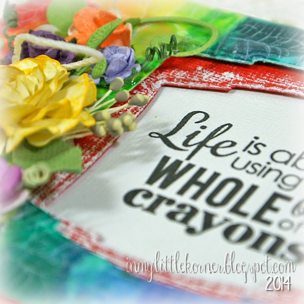
Recently, I purchased some fun sentiments from Reverse Confetti, and when I saw the sentiment on the first card, I knew exactly what I wanted to play with! It's been a long time since I played with crayons...even longer since I played with melted crayons. But the sentiment stamp was just begging for this to happen again...


Years ago during a sale at a local big box craft store, I loaded up on boxes of crayons, specifically for crafting. A peek in my closet of supplies revealed I still had 3 boxes left....perfect for what I wanted to do as my background for this sentiment stamp! 

I used a piece of cold press watercolor paper, cut slightly smaller than the front of the card so I could mat it over another layer before attaching it to the front of the card. The watercolor paper is nice and heavy, and is a bit more absorbent than cardstock, which is a good characteristic to have in this case.


I taped a rainbow-array of crayons together using painter's tape, and taped them to an old wooden cutting board that I keep handy for crafty purposes. (I used the board this time because it's easier to lift one side of the board as I melt the crayons, allowing the wax to drip down the front of the piece of watercolor paper). The red on the side was my "test run" to see if the wax would drip the way I wanted it to...once I knew it would, I placed all the crayons on top of the piece and was ready to start heating and melting. I stamped the sentiment and taped it down so I'd have a blank space to do the final sentiment stamping after the wax was melted. (In the end, it didn't matter, because I decided to do offset die-cut shapes instead.)


And then the fun started. Slowly, I melted the crayons, lifting one side of the cutting board up slightly so the wax would drip down the front of the piece. If you look back at the finished front, you can guess what step was next. I lightly and carefully reheated the dripped wax, and this time, instead of being careful to keep the heat gun in position to melt the wax straight down the front, I moved it back and forth a bit, so some of the wax moved sideways, covering all the white space and blending a bit with the colors to either side.

When it dries, you have a blended coating of colored wax on the card front piece - and a bit lumpy in places where it pooled - but no worry, that will be remedied with the next step. :)  

Now it was time to die cut a shaped opening for the sentiment. The die easily cut through the watercolor paper and crayon wax, and in the process, flattened out all the lumpy parts caused by the dripping wax. (The only thing I "measured and matched" here was to make sure I tilted the top die the direction and angle I wanted - I decided to tilt both diecuts in opposite directions as a fun change to keeping them straight.)

The final steps were to add a coat of clear crackle finish, and when that dried, some Picket Fence Distress Stain over the crackles to emphasize them.

All that was left was to mat another piece of die cut colored cardstock beneath the wax piece, and adhere both to the card base. (I used foam tape between all the layers to give some dimension to the sentiment area.) 

Diecuts, flowers, lace, pearls...time to have fun with some colorful embellishments! The large yellow rose is made with Spellbinders' Rose Creations die...


Supplies:
Stamps:   Reverse Confetti "Dream in Color"
Dies:   Spellbinders Labels Two;   Spellbinders Rose Creations;   My Favorite Things Leaf-Filled Flourish
Flowers:   Wild Orchid Crafts          Lace:   TheFunkieJunkie.com          Pearls:   Recollections
Miscellaneous:   crayons, twine, Picket Fence Distress Stain, DecoArt One-Step Crackle Finish, white craft paint


The second card, made with a different group of sentiment stamps from the same Reverse Confetti set, came out totally different...colorfully shabby and fun. This time, I took a piece of text patterned paper, and stamped it with watercolor shapes from a few different sets of stamps, and used that as the base of the card.

I stamped the sentiment onto a die-cut piece of watercolor paper, then used Distress Inks to "watercolor" patches of color over each of the larger letters in the sentiment...


I pulled the colors from the background to watercolor the sentiment block, and used those same colors within the floral cluster...


The little butterfly was punched from pink cardstock and purple patterned vellum, then touched up with a light dusting of Diamond Stickles...


Supplies:
Patterned paper:  Maja Designs Vintage Summer Basics
Stamps:   Reverse Confetti "Dream in Color";    Backgrounds:  My Favorite Things DC Abstract Art, 
Jumbo DC Abstract Art;   Stampin Up Gorgeous Grunge
Dies:   Spellbinders Labels 25;   Sizzix Flowers Branches & Leaves
Punch:   Martha Stewart Royal Butterfly          Flowers:   Wild Orchid Crafts          Lace pieces:   Prima
Miscellaneous:   Distress Inks, Wilton doily, hemp twine, Diamond Stickles, white craft paint


Thanks so much for stopping in for a visit...I hope your week is starting with a smile!


Sunday, April 13, 2014

LOTV - Happy Birthday!...

If you didn't already know, next month, Lili of the Valley celebrates its 10th birthday, and in celebration, there's a birthday card challenge going on right now...and I hope you'll join in, too!  Each of us on the design team have made a special card just for the day. Today it's my turn to share my card in honor of a wonderful company that I'm so happy to be working with.

I love the beautiful rose papers in the Always & Forever paper pad, so it was my first choice for this card...there are so many surfaces to cover that I didn't have to choose only one or two...I had lots of options...


I first saw this card design last April on Marianne's blog ... and after a good bit of oohing-and-aahing, spent a bigger bit of time trying to find a tutorial so I could make one like it. It seems to be a cross between a gate-fold card and a napkin-fold card, but I had no luck finding an existing tutorial. So, as you can imagine, I used quite a few (at least 5) pieces of cardstock trying to find the magic combination of folds, creases, punches, etc. to get the look. Then, when I finally did, I set the folded and punched card aside for another day when I had time to "gussy" it up just the right way, and write up some sort of tutorial. And there it sat, and I had almost forgotten I had it there in my "template" basket, until it was time to make up the LOTV birthday card. It was the perfect occasion to tackle this card again. 

As luck would have it, in the meantime, an online friend of mine got the same idea, and wrote the perfect tutorial...and that's when I said to myself, "self, why didn't you just wait until Rebecca got her hands on it and save yourself a lot of time and cardstock?!" So if you decide you'd like to try a card like this for yourself, head on over here to Rebecca's blog, where her tutorial makes it look so much more stress-free than I remember feeling as I was experimenting with it...LOL. 

The fun part is that there are so very many places on this card to add embellishments and decorations...and the removable large tag is what holds it all together. The large sentiment on the tag is from LOTV's Set 61, Quotables/Celebrate ...the stamped roses are from Set 66, Grunge Elements (I stamped them verrrrrrry lightly to add to the "grunge" background look)...and of course, the lace and pearls I can always find a spot for on my cards...


The mini tag at the top of the large tag is stamped with a sentiment from Set 29, Vintage Sentiments/Just to Say ...


Once you remove the tag, the card stands open like this...


There are two different papers from the Always & Forever pad used on the front. On the pink-striped corners, I stamped a decorative corner from Set 68, Corners, and heat-embossed them with white embossing powder.  With the pretty rose papers I used, I couldn't resist decorating the front corners with pink and red mulberry roses, accented with a small leaf stem and shabbied up a bit with a snippet of cheesecloth...


On the inside of the card, a couple more patterns from the Always & Forever paper pad were used, and a sentiment block added to the center.  The sentiment verse is from the A5 Verses set, and the cursive sentiment is from Set 25, Handwritten Phrases ...


A little more lace and pearl trim was the final touch...


Supplies:
Patterned papers:  LOTV Always & Forever paper pad
Stamps:   LOTV Set 61, Quotables/Celebrate;   Set 66, Grunge Elements;   Set 29, Vintage Sentiments/Just to Say;   
Set 68, Corners;   Set 10, A5 Verses;   Set 25, Handwritten Phrases
Edge Punch:   Martha Stewart Swirling Lace PATP          Scalloped Lace:   TheFunkieJunkie.com
Pearl spray:   local craft store          Pearl flourishes & mini pearls:   Recollections
Flowers:   Wild Orchid Crafts          Hug Snug seam binding
Miscellaneous:   cheesecloth, white embossing powder, white craft paint


To recap, I used (4) different pieces of patterned paper from the 8"x 8" Always & Forever paper pad to decorate this card (one of the papers used on the inside of the card was also used on the large tag), (1) 12" x 12" piece of white cardstock for the card base, and (1) 12" x 12" piece of red cardstock as "mats" for the patterns, the large tag base, and front corners between the pieces of white cardstock.

If you like using images on your cards, the large tag is a perfect place for one (as Marianne did on her original card), and you could have some fun adding them to the side pieces on the inside of the card, too. But since my focus on the LOTV team is the use of sentiment stamps and patterned papers, I decided it was the perfect opportunity for me to use several sentiment stamps on their birthday card!


I hope you'll join in on the Monthly Challenge going on right now on the Ideas to Inspire Challenge blog and enter your birthday card for LOTV...we'd love to see what you can create!

Thanks so much for stopping by today!


Tuesday, April 8, 2014

Shabby Meets Mixed Media...Just a Little Note...

Happy Tuesday, everyone. Lately my creative time has come in small increments...mostly because my creative mojo is intermittent. LOL  So I've been using this time to gather up a few new supplies and play with some new (to me) techniques...you know, the things you've seen around and said to yourself, "one of these days I'm going to play around with that." So, "these days" are here now. That's what's happened with the last two cards I've posted, and why they're a bit more technique-heavy than usual. It's easier to add techniques one on top of another when you're not doing every step at the same time - you have a little more time to consider alternatives and options.

Here's today's shabby-meets-mixed-media-and-spring card fun...


I didn't take in-progress photos with today's card as I did with last week's, but I can show you a similar piece that was the base of it. One night I played around with a couple new My Favorite Things Abstract Art stamps and Distress Inks, along with a small Maya Road ledger stamp, and made a couple pieces like this using a couple different color combos...they sat in a baggie for a few days until I got around to playing with them again:


(I lightly and randomly swiped a cotton rag on parts of the ledger stamp after inking it to get the uneven and faded areas and edges.)

The first step of the layering was to use gesso to adhere a small piece of cheesecloth in the center, and to spread the edges of the gesso out toward the edges and onto the ledger stamp to lighten the center. The nice thing about gesso is, with a single coat, it's not as heavy and opaque as acrylic paint, so it gives that lightened-color look without being too overly obvious.

Next, I grabbed a Crafters Workshop reverse chickenwire template, and applied modeling paste mixed with black acrylic paint over the left upper corner, partially covering some of the ledger stamp. After I applied the black accent, it looked a little too bold for the overall look I was going for, so out came the gesso again, and I lightly dry-brushed a little more gesso over the part of the chickenwire closest to the center...it gives it a bit of a shabbier look...


At the bottom of the piece, I used a Tim Holtz Measured template, and this time, applied the modeling paste straight out of the container, and let it dry. Can you see the fun effect this makes, all on its own?


The modeling paste seemingly "absorbs" the color of the inked area just beneath it, adding to the subtlety of the paste accent. You can see that the brown, blue, and pink inks from the base piece show through the ruler template lines of the paste right over them. (If I had wanted an opaque white appearance, mixing the paste with white acrylic paint would have done the trick...but this time, I wanted the ruler line to be understated, and just a bit of contrasting texture at the bottom of the card.)

Then it was time to add fun die-cuts, flowers, pearls, a snippet of crocheted lace, and a sweet little sentiment stamp. At the center of the florals is a two-toned gardenia, and it's surrounded with a couple lilies and roses...


Supplies:
Stamps:   My Favorite Things DC Abstract Art;   My Favorite Things Jumbo DC Abstract Art;   Maya Road Ledger;
Papertrey Ink Mat Stack 2 Collection ("just a little note")
Dies:   Memory Box Chloe Stem;   My Favorite Things Leaf-Filled Flourish
Templates:   Tim Holtz Measured;   The Crafters Workshop Chickenwire Reversed
Flowers:   Wild Orchid Crafts          Lace:   TheFunkieJunkie.com          Pearls:   Recollections
Miscellaneous:   Maya Road leaf stick pin (embellished), Distress Inks, cheesecloth, gesso, modeling paste


Thanks so much for stopping by today...I hope your week started with a smile!


Wednesday, April 2, 2014

LOTV - Let's Celebrate

Good morning, all! There's a fun birthday challenge this month over at the LOTV Ideas to Inspire Challenge page. Lili of the Valley is turning 10 next month! I'll show you the birthday card I made soon, in a separate post. The challenge runs until the end of the month, and winners of three prizes will be announced May 1st. That gives you lots of time to enter...and remember, I have a link to the challenge page over on the right sidebar of this blog if you should ever need it.

In the meantime, I have a fun card that I made as a "congratulations" card, but after a bit of thinking, I guess you could also use it as a birthday card. In previous posts, I've used the LOTV background stamps in lieu of patterned papers...as I did on this card. This time, I wanted to make a patterned paper using a variety of different LOTV stamps. You may not have the same selection of stamps in your stash to use, but I wanted to show how using a combination of large and small stamps can make a fun one-of-a-kind background for your cards. Here's the end result of my play with some of my LOTV stamps...


On a piece of watercolor paper, I've used a stamp from Set 21, Grunge Corners in the upper left corner, and a smaller stamp from Set 68, Corners in the lower right corner. I filled in between the two along the lower edge with a text stamp from Set 66, Grunge Elements, and a Paris postmark from the same set in the upper right corner. The last piece of the background was a cancellation mark from Set 22, Love Sentiments over the Paris postmark. Here's what the piece looked like at the start, with only the stamps...


I placed the stamps just inside the paper edges because I knew I wanted to heavily distress them and didn't want to lose the edges of the stamps to the distressing. Originally I had planned to put only a large floral grouping in the diagonal open space, but then I found a piece of Antebellum patterned paper left from a previous project (if you're looking at the thumbnail of the paper pad on the LOTV site, it's the aqua, purple, and green piece in the lower right of all the small pictures). I cut that leftover piece of patterned paper to fit the opening, and used my Distress Inks to outline where the paper would go so I could "shade" the edges beneath the patterned paper to give it the illusion of dimension...you can see that I had started to "drag" the color down using my watercolor brush to darken the area around the paper...


Then I started adding the background color with Distress Inks and a watercolor brush...about halfway done in this photo...


Once the coloring was complete, I distressed the edges with an edge distresser, added a piece of palest aqua paper from the Timeless Victorian paper pad behind the watercolored paper, added some machine stitching and edge distressing on the aqua paper, and adhered the pieces to the deep purple card base. All that was left was to add the patterned paper to the center of the watercolored front, and embellish. 

But I wanted to play some more, so on the small diagonal piece of patterned paper, I added some stenciled crackled texture paste, then lightly rubbed in some violet metallic rub...you can see a closeup in this photo. (I die cut one of the new Tim Holtz Frameworks die from Grafix Stencil Film and used it to add the texture paste in the open areas). The sentiment on the banner is from Set 25, Handwritten Phrases ...


Here are a couple closeups of the floral clusters...I added little "dew drops" on the flowers using Viva Glass Effects Gel...


On the inside of the card, I added another "celebration" sentiment from Set 10, A5 Verses to complement the sentiment on the front of the card...

Supplies:
LOTV Stamps:   Set 21, Grunge Corners;   Set 68, Corners;   Set 66, Grunge Elements;   Set 22, Love Sentiments:   Set 25, Handwritten Phrases;   Set 10, A5 Verses
LOTV Patterned Papers:    Antebellum;   Timeless Victorian
Dies:   Tim Holtz Tattered Banners;   Tim Holtz Courtyard Frameworks;   Sizzix Flowers Branches & Leaves
Flowers and stamens:   Wild Orchid Crafts          Pearls:   Recollections
Miscellaneous:   Studio 490 Crackled Texture Paste;   Viva Inka Gold Metallic Rub-Violet;   Distress Inks;   cheesecloth;   Viva Glass Effects Gel


Thanks so much for stopping by today. I hope you'll join in on the birthday challenge fun and enter your birthday card to the LOTV challenge site!


Related Posts Plugin for WordPress, Blogger...