
Today I have another mini art journal spread that went in a different direction than originally intended. As one of my sweet blog friends, Lizzyc, recently commented, art is truly "alive." It sometimes has a mind of its own, and is totally subjective, and so often it's just plain fun to go with the flow!
Here's the latest page spread in my small Dylusions art journal...

This layout is filled with texture. If you've been with me here for a while, you know that now and then I pull out my scraps bag filled with unused die cuts, lace snippets, and other assorted pieces that were set to go on a project, but got put aside. It's a fun challenge when I pull out that baggie, spread out the contents, and pick some elements to use.
Here's a pic of the some of the pieces that were chosen from the baggie for this layout...

There are pieces of gathered lace that were ungathered, punched borders, die cut frames and pieces of frames, strips of torn text paper, chipboard ruler pieces, and resist-canvas birds and some kind of flying insect (that I choose not to bother knowing specifically what it is because I'm not fond of flying insects - which is why I probably didn't use it the first time! LOL).
I started by gluing pieces in a mostly horizontal pattern to the pre-gessoed pages in my journal...

I also added some pieces of netting from a bag that once held something...can't remember...but I knew I could use that netting one day. (I'd already colored the two birds before I remembered I hadn't snapped a stepout photo yet...oops.)
It was only after I adhered the canvas birds and insect that I realized that since they were resist canvas, I needed to color them first so the contrasting pattern covered with the resist medium would show up. If I simply gessoed over them again before coloring them, the resist pattern would be lost. So I colored the birds and insect (carefully with a small watercolor brush), and when dry, coated them with gel medium in the centers, so most of the new coloring would be unaffected when I sprayed and spritzed and splattered colors onto the pages.
And here's another fun fact...the day after I had finished this step and set the book aside until the next night, I was scrolling through my feed on Facebook and came across an online friend whose work I absolutely love-she's been an inspiration to me to get out my journals and play again. Marta had posted a couple pages from her journal that were at the same point in construction...and looked amazingly like my two pages above...snippets of diecuts and laces and little ephemera pieces, in almost an identical layout. And yet, our two completed pages turned out so differently you'd almost not recognize how close in design they began. Click here to go directly to Marta's post showing how her page turned out (if you scroll down to the 3rd and 4th photos you'll see the base page before coloring). Fun, right?
The next step was to apply a second coat of gesso over all the layers of papers, netting, lace, etc., brushing it on around the three canvas pieces. Now all the different original colors and surfaces will color more uniformly, and the centers of the three resist canvas pieces will retain their newly-applied colors because of the topcoat of gel medium.

As soon as I started spraying colors, this page took on a mind of its own. All those background pieces simply became textures that nestled around the spray puddles and formed contrast areas...so I just went with it...no process, no reasoning, just an "I wonder what will happen when I do this" attitude... letting the colors combine and drip and settle in.
Once the colors were on, I started adding some fun extras...a couple rusted hearts from my stash...and a couple spiral clips that started out as bright gold but became "rusted" with the help of gesso and a few different sprays...
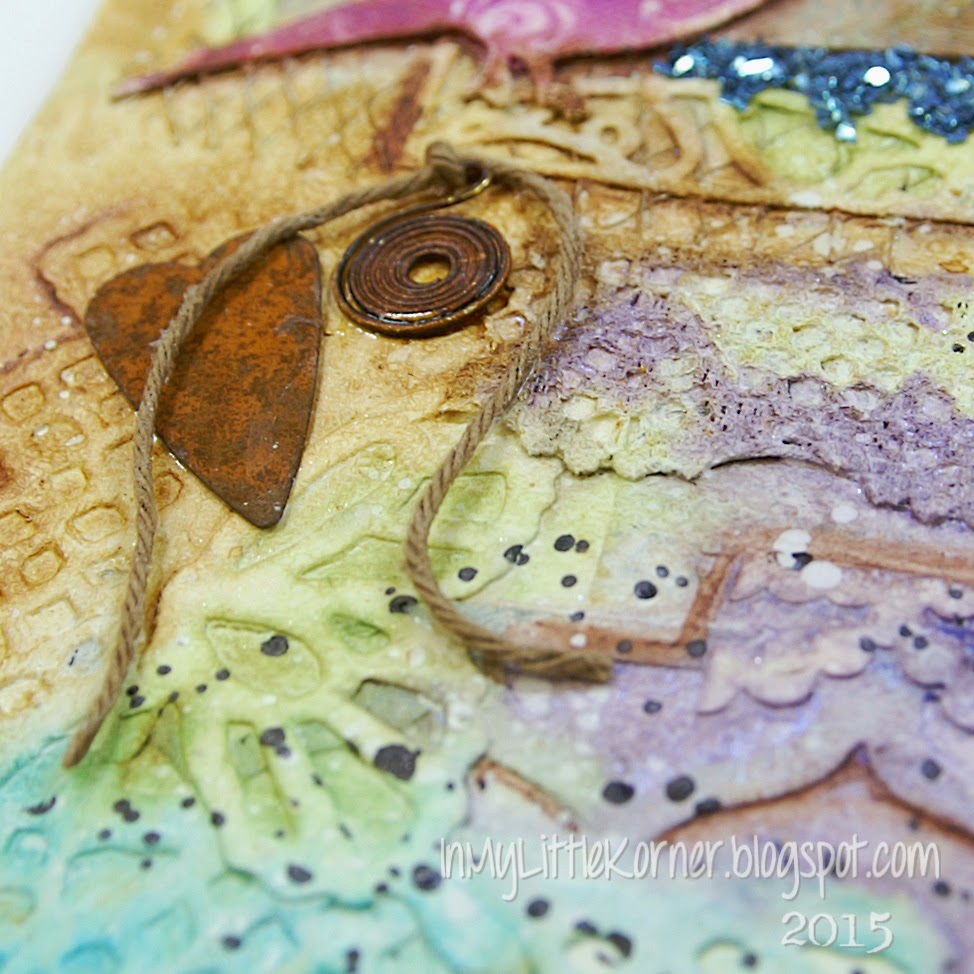

I found the quote in my trusty "quote notebook" and printed it onto cardstock before cutting it into strips and gluing onto the canvas. Blue mica flakes added a sparkly touch beneath some of those strips of paper and lace that formed the heavily-textured background...


Supplies:
Color Mediums: Lindy's Stamp Gang sprays - Sweet Violet Purple Teal, Caribbean Blue, Tilt-a-Wheel Teal, Tea Pot Purple,
Aloha Avocado, Rusty Lantern Lime, Bayou Boogie Gold
Liquitex Ink! - Titanium White & Carbon Black Archival Ink-Coffee
Stamps: Stampin' Up! "Gorgeous Grunge"
Rust Hearts: TheFunkieJunkie.com Twine: The Twinery Resist Canvas Shapes: Prima
Mica Flakes: Stampendous Frantage "Oceanic"
Art Mediums: Golden matte gel medium, Liquitex white gesso
Thanks for popping in for a visit today...I hope your week is starting with a smile!

This project is enchanting!! Beautifully done Kathy!! Hugs, Rebecc
ReplyDeleteHI Kathy!!! Thank you so much for taking us on your creative journey with this layout .. which is so incredible with all it's textures!!!!!!! Another work of art!!!!!!
ReplyDeleteI hope you are doing well! :) Wishing you a beautiful week my dear!
Big Hugs,
Elise
It looks fabulous!
ReplyDelete