Friday, June 13, 2014

Happy Fathers Day, Take 2...

Happy Friday the 13th, everyone! I prefer to think of today as a "good luck" day instead of the traditional outlook...so I hope good luck follows you all day and night long.

To end the week, here's one last Father's Day card that could actually be used for any occasion requiring a masculine card, since the sentiment here is on a tag. I first saw the idea for the triptych-like map paper treatment on Pinterest a while back, but I didn't pin the project, just wrote "triptych map paper" on my ideas page in my little notebook. So I can't take credit for the idea, but now I can't find the original project or pinner to credit them here.

Once again, I used contrasting textures, along with deeper shades of teal, kraft and black, to give a masculine feel to the card. I ran the teal Kraft Core cardstock through a paper crimper, then sanded it to make the core show through the raised lines...


On top of the twine bow, I used a sprocket piece from a prepackaged embellishment set, and added a couple washer-like doodads (yep, that's what I call them. I don't know the proper names of most of the hardware I picked up in Home Depot years ago to use in my crafting. All I know is that I have lots of "doodads" and "thingies" in my crafting hardware drawers LOL). I used Glossy Accents in the centers to make sure all three pieces were secure, then added a tiny bit of teal craft paint in the center to blend it all with the rest of the card...


Scattered around the card is some Aged Silver Frantage embossing powder...


These large berries on the stem were purple when I purchased them...a coat of teal craft paint made them the perfect match on this card...


Supplies:
Papers:   DCWV (burlap paper);   7Gypsies (map paper);   Tim Holtz Kraft Core/Coredinations (teal)
Sprocket:   Hobby Lobby/The Paper Studio           Berry branch:   Petaloo
Embossing powder:   Stampendous Frantage          Miscellaneous:   twine, silver hardware


Thanks so much for visiting today...have a wonderful weekend!


Thursday, June 12, 2014

Watercolors Meet Mixed Media and Shabby Chic...

Hello, again! Today's card is loaded with techniques and fun...I hope you agree! I have a very special use in mind for this card.

It started with a text stamp on watercolor paper. The next step was to color with bright watercolors in orchid, turquoise, and green. Then cheesecloth was adhered using gesso to secure it, and once dried, the cheesecloth/gesso areas were spritzed with homemade sprays in turquoise and light green. Then, crackle texture paste was added using a stencil. Once the base was done, it was time for embellishments! :)


Here are some closeups around the four corners...


The white rose is made using Spellbinders Rose Creations die...


The butterfly was double-punched, with clear coarse glitter added to both layers...


Supplies:
Text Stamp:   Inkadinkado          Stencil:  Memory Box Rings & Puddles
Dies:   Memory Box Whimsy Circle;   Poppy Stamps Massa Leaf Background;   Spellbinders Ironwork Motifs;
Spellbinders Rose Creations
Punch:   Martha Stewart Monarch Butterfly Double Punch         
Flowers:   Melissa Frances (white pompom);   Prima (branch and seeds);   Wild Orchid Crafts (sweetheart blossoms)
Dotted muslin strip:   FreshLemonBlossoms on Etsy           White burlap:   TheFunkieJunkie.com
Pearls:   Recollections;   Queen & Co.            Watercolors:   Sakura Koi 
Studio 490 Crackle Texture Paste          Miscellaneous:   eyelet trim, gesso, cheesecloth


Thanks for joining me for the watercolor fun this week. Tomorrow I'll end the week with one more Fathers Day card before Sunday's holiday.


Wednesday, June 11, 2014

One Technique...Three Looks...

Happy "Hump Day!" Today I have three cards to share that all are made using the same technique...another one I learned during the Watercolor for Cardmakers online class.  It's a pretty simple technique using stencils in a different way, and definitely one that's fun to experiment with!

They're all Clean and Simple, and two have a bit of Shabby Chic added to the mix. With this first one, I was inspired by a beautiful photo I saw of a morning sunrise, and that gave me the idea to use the particular stencil I used. So I loaded watercolors in a couple different purples, a bright golden orange, and a deep orange, and here's what I got...


I added a small heart, machine "stitched" it without thread around the edges, and used a combo of stamping and a die cut for the sentiment. Here are some close-ups...


I was happy to see the way the watercolors blended as they dried, and the design of the stencil was perfect for the "sun rays" I was hoping to get. I followed the placement of some of the lines caused by the stencil to machine-stitch some lines to the bottom of the card front...


Supplies:
Sentiment stamp:   Winnie & Walter "The Big, The Bold, And You"
Dies:   Technique Tuesday "Say It-Fabulous";   Papertrey Ink "Limitless Layers-Heart Stitches"
Stencil:   Memory Box "Texture Brilliant"
Orange gemstone:   EK Success            Watercolors:  Sakura Koi


This next card uses a chevron stencil, turned on its side, and very *bright* watercolors. :)  I highlighted the straight lines of the chevron edges and center with machine stitching. The splatters are actually stamped...I didn't trust my splattering technique that day, and realized that I had an ink that matched the bright pink watercolor, so that's what I went with!


A couple close-ups...


Supplies:
Stamps:   Winnie & Walter "The Big, The Bold, and The Happy";   Stampin'Up! Gorgeous Grunge
Stencil:   Tim Holtz Chevron            Gems:   Kaisercraft
Watercolors:  Sakura Koi


The last card for today is actually the first one I made. It's very close to the card that was taught in the online class, and actually allowed me, for the first time, to see the difference in the different brands of watercolors. The watercolors I used for this card are a bit paler, softer, and leave a more "chalky" finished look than the other two cards...still pretty, but a different look that you may not be able to actually see in the photos...


Supplies:
Sentiment stamp:   Winnie & Walter "The Big, The Bold, and You"
Stencil:   Tim Holtz Chevron            Watercolors:  Loew Cornell
Miscellaneous:   silver sequins, white twine


Thanks for stopping by today. Tomorrow I'll be sharing a "fully loaded" mixed media and watercolor card. Until then, have a great day!


Tuesday, June 10, 2014

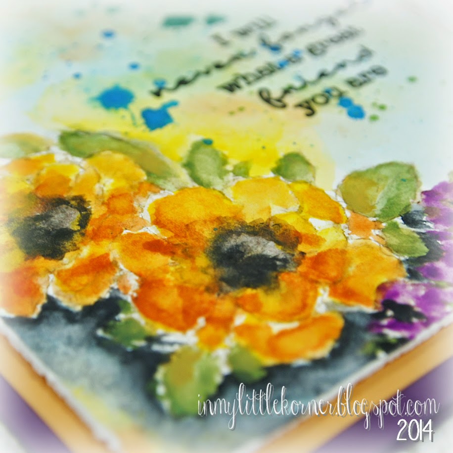
I Will Never Forget...

You're not seeing things...I'm here two days in a row this week! In fact, there will be a post every day this week, since I want to squeeze in one more masculine-looking card at the end of the week before Father's Day on Sunday.

Today's card is another Sanketi inspired card. I was so intrigued with her free-flowing style when she taught a segment of the Watercolor for Cardmakers class over at Online Card Classes (you can still sign up and take this class if you're interested), that hers was the first technique I played with once I had time to sit down and create. There's no question I still have a long way to go, but it sure is fun working my way there!


And just a couple closeup views...


Supplies:
Stamps:   Penny Black "Flower Garden" ;   My Favorite Things "LJD Forget Me Not" (sentiment)
Watercolors:   Koi Sakura


Thanks for visiting today! I'll be back tomorrow with a multi-card post showing another watercolor technique. Have a great day!


Monday, June 9, 2014

LOTV-Happy Father's Day...

Happy Monday, all! This week will be watercolor and mixed media week here on the blog, so be prepared for a few more cards that stray from my usual style a bit. Of course, when we come to the mixed media portion of the show, my usual "everything but the kitchen sink" style of embellishments will be clearly visible to you. :)

Today's card is a masculine card, combining a couple Lili of the Valley stamps and watercoloring with Distress Inks. Because the piece turned out so detailed, I went with a CAS (clean and simple) style for the card.  I used LOTV's  Set 53, Vintage Backgrounds (I used the same stamp as shown in Elise's sample on the product page), only I did some "selective inking" to mask off the dragonfly and the cherub. Then I stamped a couple of the clocks from Set 66, Grunge Elements, and added the key and French text from that same set to fill in some of the blank space between the clocks.


I used liquid frisket to mask off the clocks and the scrollwork at the top of the piece, and after wetting the whole piece of watercolor paper, started laying in colors using Distress Inks. I let the colors drift where they would, and when it was done, I looked at it across the table and realized it came out looking a bit like a vintage map, with the blue waters and brown and green land masses.You never know what you'll get when you just let things happen on their own!

After the watercolor paper (I used 140 lb cold pressed) had dried, I sprinkled it with Vintage White Frantage embossing powder...


I pulled out a metal cog, and before tying it with the twine, coated it with more of the Frantage embossing powders (I mixed Vintage White and Vintage Gold on it), added a tag printed on my computer, and it was done!...


Supplies:
Stamps:  LOTV Set 53/Vintage Backgrounds, and Set 66/Grunge Elements
Die:   Impression Obsession Mini Rectangle Tags 2
Metal cog:   Hobby Lobby/The Paper Studio          Stampendous Frantage Embossing Powders
Ranger Distress Inks (Peacock Feathers, Crushed Olive, Rusty Hinge, Vintage Photo)
Miscellaneous:   twines


Thanks for stopping by for a visit...I hope your week starts with a smile!

Thursday, June 5, 2014

Seeing Double...

Hello again! As I was making the first of the today's cards, I happened to glance to the side at the pieces left from cutting the patterned papers, and realized they were just the right size to make an A2 card at the same time...so that's what I did. :)

The hot temps lately got me in the mood for monochromatic whites, so I paired a more taupe-based white with a cream-based white, and used all shades of white embellishments with the exception of one deeply colored rose in the center. There's no sentiment on either card yet...but there's plenty of "white space" left (oh, I can hear your collective groans all the way out here on the left coast at that sad attempt at a play on words...ha) if I choose to add one later on.

The square version...


And some close-ups of the flower cluster...each card has one of the gem-filled metal flowers as one of it's three largest flowers in the cluster...


And the A2-sized version of the same design...


Supplies: (the same for both cards)
Patterned paper:   Basic Grey Basics White (6x6 pad)
Dies:   Poppystamps Mod Flower Border and Massa Leaf Background
Flowers:   Wild Orchid Crafts          Pearls:   Recollections          Metal gem flowers:   local craft store
Miscellaneous:   white cording, cheesecloth, cardboard (painted)


Thanks for stopping by today!


Related Posts Plugin for WordPress, Blogger...