Showing posts with label The Crafters Workshop. Show all posts

Monday, August 24, 2015

Mixed Media - Believe in Magic...

Happy Monday, everyone! I had to take a little break from crafting recently to tend to some family business and a sick family pet, but I was able to sneak in some crafty time in small bits and pieces during the past couple weeks, and will have a couple projects to share with you this week. :)

The first is a canvas (of sorts) to get back on track for Mixed Media Mondays. I recently purchased some newly released paints by an artist friend, Cheryl Mezzetti. They're called Perfect Paints, and they're acrylic paints with a beautiful sheen to them...colors that are brilliant with just a bit of reflectivity that makes the colors dance...they're called Shimmering Matte Acrylics, and the hardest decision to make was which colors to start my collection with!

Here's the finished project...


Can you tell what my "canvas" is by this photo?


In my stash, I had the backing chipboard piece from an empty wirebound 9x12 watercolor paper pad, already gessoed for later use. When my paint order arrived, I pulled out that piece, and started laying on colors - just playing to see how they covered, how they blended with each other, and what would happen when I layered one on the other after drying. These colors are so rich!

When I saw how beautifully the colors blended, an idea started to take shape...and that's about the time that other life issues started taking priority over my crafting time. So I started jotting notes on post-its as the ideas came while I was tending to other things, and playing with those ideas when I had a few minutes in the evenings.

Along with the paints, I purchased a few colors of Perfect Paints Polishing Plasters...a sort of molding plaster with color...but a bit of a different texture, and when buffed, a slight sheen...or when burnished, a shabby, vintage look. So, following my "try this" notes, I pulled out a couple stencils, and played with laying down the Plasters...and then I had this...


Here's where you can see how different the colors look when the combo of natural light and Ott lights aimed at the canvas board (in my little homemade photo booth) reflect the sheen of the paints. In real life and to the natural eye under normal room lighting, the colors look more like they do in the first photo above. 

I used "Organic Sugar" Polishing Plaster for the stripes along the left side, and a combo of "Cayenne" and "Sunwashed Clay" Polishing Plasters for the tree and branches. Once they had dried, I burnished each with the metal blade of a palette knife, and it gave them a smooth but vintage appearance.

As a finishing touch, I used Stabilo All pencils in black and brown to add a little bit of shading and dimension before adding embellishments on top of the pastes.

And here's where taking stepout photos ended, as I only devoted short periods of time in the following couple weeks to add bits and pieces to the canvas board. 

Among the little burlap flowers and diecut cardstock leaves decorating the tree branches, I added some dark bronze metal flowers, touched up with pink and yellow Shimmering Matte Acrylics. I also dry-brushed those colors on top of the multicolored micro and seed beads that I added around each of the larger metal flowers...


These chipboard hearts were first painted with the pink paint (Peony), and then a watered-down "wash" of the Peacock Blue paint gave me the violet/purple shade for a little variety...


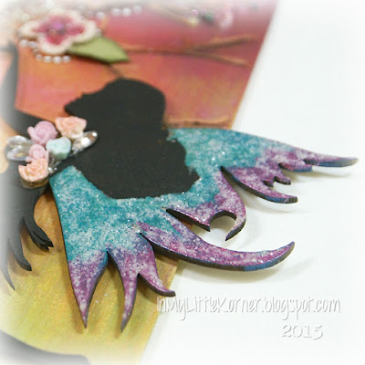
I had painted this chipboard fairy for another project, and didn't use it, so I covered it up with black heavy gesso, then added some of the Peacock Blue and Peony paints to the wings, and topped them with some Rock Candy Distress Stickles...


The sentiment stamp is by Unity Stamp Company - it already has some of the words "blocked" but I drew in a couple more lines and some white dots around "magic" for fun...pens write beautifully over these paints! The pink and blue Shimmering Matte Acrylics were added inside the crystals of the butterfly to make it stand out a bit more...


Supplies:
Color Mediums:   Perfect Paints Shimmering Matte Acrylics ("Cantaloupe" "Rain Slicker" "Peony" "Peacock Blue" "Moss Green")
Perfect Paints Polishing Plasters ("Organic Sugar" "Cayenne" "Sunwashed Clay")
Stencils:   The Crafters Workshop "Branches Reversed";   Tim Holtz "Stripes"
Dies:   Simon Says Stamp "Fancy Believe";   My Favorite Things "Rose Leaves"
Chipboard:   Dusty Attic "Garden Fairy" and "Heart Attack Panel Small #2"
Stamp:   Unity Stamp Company "The Time is Now"
Burlap flowers:   The Paper Studio             Metal flowers:   theFunkieJunkie.com
Crystal butterfly:   Prima             Gems:   Prima and Creative Imaginations
Mixed media ink supplies:   Faber Castell Pitt Artist Pens (black);   Stabilo All pencils (black & brown);   
Mangaka black fine and medium pens;   Uniball Signo white gel pen
Beads and glitter:   Rock Candy Distress Stickles;   Martha Stewart clear coarse glitter;  silver and pink German glass glitter;  
 Doodlebug Sugar Coating BonBon glitter;   craft store micro and seed beads


Thanks for visiting today...I hope your week is starting with a smile!


Thursday, June 25, 2015

Mixed Media Steampunk Card...

Hello, again! I mentioned on Monday that I'd be sharing a card using another of the "smoosh" papers in the photo...and here I am to share a mixed media Father's Day card with a definite steampunk influence - something you don't see me make very often. (This is the gold, copper, and silver metallic piece in the very front of the photo from Monday's post.)

Although I'm showing this late for this year's holiday (had to be sure it was well in hand first), it could easily be adapted for any occasion requiring a masculine card by switching out the sentiment square I used here.

I've had this Father's Day sentiment stamp for quite a while now, but hadn't ever used it. It's perfect for this card, so I stamped it onto kraft cardstock and embossed it with black powder.

The fun part about this card is that, although it looks like it has a lot of metal embellishments, the only real metal pieces are the small findings in the centers of the cogs, and the paper clip - all the rest are chipboard, painted to give the impression of metal...


The chevron piece was cut from medium weight chipboard, treated with Dusty Attic Rusting Powder, then dry brushed with Lumiere Olive Green paint to add a green patina. 

The cogs were die cut from lightweight chipboard (I cut two layers for each so they wouldn't warp from the paints) and painted with both a blue and green metallic paint after first coating with black gesso. 

The Tim Holtz Grungeboard crown, arrow, and numbers, and the Dusty Attic chipboard chain at the bottom, are all painted the same as the cogs. Here are a few detail shots...


I had more fun over in the upper right corner. First I mixed some modeling paste with Cattail Copper Brown Lindy's Stamp Gang Magical powder, then mixed in some gold micro beads, and applied it through a distressed harlequin stencil, leaving some areas of some of the shapes uncovered.

Once the brown was dry, I added black heavy gesso through the areas left uncovered by the copper paste, sprinkled gold micro beads onto the black gesso, and removed the stencil. 

(And now comes the part where I breathed a sign of relief that my experiment worked, because, in my push to do this, I realized I hadn't experimented first to be sure this *would* work the way it did in my brain.)

Once the harlequin shapes were completely dry and stable, I went over the bright gold micro beads in the gessoed sections with an aqua (BT5) Spectrum Noir solvent marker. Thankfully, it looked just as I had hoped it would...the aqua shade was the perfect blend with the metallic paints used on the left side of the card...phew! 

After mixing up some Cowabunga Copper Lindy's Stamp Gang Magical to add some "distressed shading" to the right of the uneven harlequin shapes, I used the little bit of paint left to add some splatter to the right side of the card.

Supplies:
Dies:   Tim Holtz Sizzix "Chevron";   Memory Box "Antique Gear Set"
Sentiment stamp:   Inkadinkado
Color mediums:   Lindy's Stamp Gang Magicals and sprays;   Lumiere 'Met Olive Green" paint;   Viva Precious Metal Effect Paint "turquoise";   Dusty Attic Rusting Powder;   Spectrum Noir marker BT5
Stencil:   The Crafters Workshop "Mini Harlequin"            Chipboard chain:   Dusty Attic "Mini Chains"
Crown,  arrow,  numbers:   Tim Holtz Grungeboard 
Miscellaneous:   brads,   Prima mini findings,   paper clip,   Golden modeling paste,   gold micro beads,   heavy black gesso,   black embossing powder


Thanks so much for stopping in for a visit today!

Monday, June 22, 2015

Mixed Media Canvas - Where There is Love...

Happy summer Monday...it's now official...there's a reason for the hot, and very dry, weather we're having! LOL

Today I have another photo-heavy Mixed Media Monday share for you...an 8x10 canvas board with a fun and *very* colorful background...


Do you remember this photo from a while back?


This is a pic of some of my "smoosh" papers - pieces of mixed media and watercolor paper colored by "smooshing" them into the leftover paints from previous projects and/or my handmade color charts of Lindy's Stamp Gang sprays and Magicals. (On Thursday, I'll be back to show you a card made with the bronze/gold/grey piece in the front...but today's piece features a bit of three of the papers in this stack, along with a few others not pictured here.)  

I wanted to make a brightly colored background for a canvas, and that's when I remembered my smoosh papers...and realized I already had the background in my basket all along! So I pulled out an 8x10 canvas board as a base, and started laying out and rearranging and re-sizing pieces. I stamped the final-choice pieces with a few fun mixed media stamps using grey Archival Ink to add some muted background images, then began gluing the pieces to the canvas with matte medium. I wound up with a starting canvas looking like this...


Then I took some smaller pieces, punched and played with the edges and ends, added stitching to a few, and glued them down with matte medium on top of the base pieces to add texture and more color variety ...


The next step was to pull out a couple coordinating stencils and add crackle texture paste...


Next up, splatter some white acrylic ink over the background, just for fun. Then I added some more LSG Magicals to color and shadow the crackle paste areas once they were completely dry.

Before adding embellishments, I needed to add an "anchor" for the large floral cluster and little pieces that would fill the center of the canvas.  I die cut two of the "Sketchy Rings" dies and glued them together in the center to form one long piece of distressed circles. 

The clear frame in the center is a Making Memories frame that's been in my stash forever...I knew I'd find the perfect use for it one day! 

And finally, black Archival Ink was brushed around the outside edges. I think the dark contrasting edges keep the eye from drifting off the edges of the canvas, and bring it back to all the fun embellishments and sentiments that will be in the center...


And now on to some closeups of the finished piece. There were quite a few "happy accidents" as I was pulling embellishments for the canvas, and I love how so many long-stashed pieces, in addition to the clear acrylic frame in the center, finally found the perfect use.

The "love" key was a recent purchase, but it was gold and didn't have enough contrast with the background, so I covered it first with black gesso, then accented with a couple different colors of Lumiere paints - and now it's perfect...


And then I found this in my metal charms drawer, and how perfect a fit is it? It's an old Making Memories plaque with the perfect quote to go with the "love" key. I accented the lettering with pink acrylic craft paint, then added more Lumiere paint around the edges, popped some foam adhesive on the back, and nestled it into the sides of the flowers...


There's still a bit of the black diecut circles peeking through at the top...I didn't cover them completely...LOL. ..


The metal butterfly was originally a dark bronze color. I had added Alcohol Inks in magenta and copper to it for another project, but didn't use it then. I pulled it out again for this canvas, dry-brushed black gesso around the outer edge for contrast, then added some Lumiere paints to the inside to bring all the colors of the canvas onto the butterfly...


I discovered that one of the Tim Holtz Idea-ology clock faces fit inside one of the diecut circles perfectly...the color was just not right. Dry brushing a little more black gesso and Lumiere paints took care of that, and a couple small black watch hands in another tiny stash drawer add the perfect finishing touches. 

Below that, another happy find...a long-held Making Memories word charm, this time the word "life," the second half of the quote in the larger sentiment charm...perfect! :)


Supplies:
Color mediums:  Lindy's Stamp Gang assorted Sprays and Magicals;  Lumiere paints "Halo Blue Gold" and "Halo Violet Gold"
Stamps:   Unity Stamp Co. "graffiti art";   LOTV "Set 66-Grunge Elements"
Stencils:   The Crafters Workshop "Mini Chicken Wire" and "Mini Chicken Wire Reversed"
Art Mediums:   Studio 490 Crackle Texture Paste;  Art Basics Heavy Black Gesso;  Liquitex Ink!-Titanium White
Dies:   Memory Box "Sketchy Rings"             "Love" key,  metal butterfly,  lace:   TheFunkieJunkie.com
Metal clock face:   Tim Holtz             Fleur de lis charm:   Prima             Chipboard chain:   Dusty Attic "mini chains"
Clear acrylic dotted frame,  metal word charms:   Making Memories             Pearls:   Recollections
Flowers:   Prima,  Wild Orchid Crafts,   local craft store            Pink stamen clusters:   ChocolateLetters on Etsy
Miscellaneous:   watch hands,   acrylic craft paint


Thanks so much for visiting today - I hope your week is starting with a smile!

Monday, June 1, 2015

Art Journal - Be a Butterfly

Happy Monday, everyone! This week is starting with a Mixed Media Monday art journal page share...and it's something a bit different for me. My art journals are little places to experiment and play, so not every layout is a "work of art"...more like a "work of wonder" as in "I wonder if this will work..." :)

I wanted to do something with my Indigo Blu/Limor Webber "Ink Splat Butterfly" stamp, and I wanted to pair it with a new Unity Stamp Co. butterfly quote stamp. But since I'd just about finished with another bright and sassy and experimental butterfly layout in my journal (you'll see that one next week), I wanted this one to be a bit moodier. (hmmm...wonder if the fact I was watching recorded "Falling Skies" episodes had anything to do with that...ha!)

Here's the finished layout in my small Dylusions journal...


The use of a lot of embossing powders, and paints with iridescence mixed with the flat paints and inks, gives this "moody" page a touch of brightness...here's a side view of the reflective surfaces...


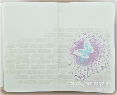
Want to see how it evolved? The first step was to stamp and emboss the butterfly...I chose a couple different colors of embossing powder..so far, so good. Then I got an idea, so I masked the butterfly before applying the modeling paste through a brick stencil...


I wondered if this last step would give me the impression of looking through a hole in a brick wall at a butterfly flying in the distance. So I went ahead and colored the brick wall using a few different Lindy's Stamp Gang Magicals, and shading with a few more...some flat, some iridescent...keeping the mask over the butterfly stamp as I painted the bricks and mortar...


Then I painted in the background colors with more Magicals...blue, orange and pink in the sky area, and more green and blue at the bottom. When I added some darker shading colors around the edge of the "hole," I started to see where I was headed with the layout. Mind you, I did think twice when I got finished with this step...I kind of liked the bright and happy feel to the page. So I let it simmer in my head overnight, while I did other things and wondered if I really wanted to take this in the direction I originally envisioned...


When I came back to it the next day, I looked at the wall and thought "no brick wall with a hole in it is going to look that neat...it needs some graffiti on it."  So out came more embossing powders, and a Ranger Fudeball pen, and a script stencil to get me started with my letter shapes, and by now the page had a mind of its own and I was just going with the flow. I used some acrylic craft pigments to draw in some stems and tiny orange and magenta flower petals and leaves along the bottom edge..


At this point, all I needed to do was add some more shading, play around with those circles in the upper left, add some more texture with modeling paste, gussy up the butterfly, and add the sentiments...and that's how it ended up as in the top photo!

Here's a less reflective closeup of the embossed and stamped and shaded circles in the top left...


I used my Indigo Blu "Rugged Edge" stamp to get the embossed edges along the top. First I embossed with a dark blue powder, then topped with a lighter jade-slate powder. Here's a closeup of the two colors...at the top, the jade-slate deepened the blue, at at the bottom you can see how it's a beautiful green-grey shade...


Over in the right corner of the layout, I wanted some more circles, but not as heavy as those on the other page. So I pulled out one of my stencils and applied modeling paste through it...texture and some of a similar element on the opposite corner. (See that light "brown" at the upper left of this pic? That's the jade slate embossing powder over the orange paint...a totally different appearance when over the other color, but the same powder!)..


And finally, a closeup of the dressed up butterfly. Using a Fudeball pen, I drew inside the blue embossed circles on the wings to give them a textured look, outlined the outside, and added a strip of rhinestones through the center...


Supplies:
Color Mediums:   Lindy's Stamp Gang Magicals:   Rizzos Rowdy Red,   Bodacious Blush,   Sandra Dee Sepia,  Gag Me With a Spoon Grey,  Pink Ladies Pink,   Pretty in Pink Pink,   Luscious Lime,   Tilt a Wheel Teal,   Orange Creamsicle
Lindy's Stamp Gang Embossing Powders:   Bonjour Butter,   Aurora Amethyst,   Tilt a Wheel Teal,   Hyacinth Blue Jade,   Twilight Jade Slate
Ranger Fudeball pen - black;     acrylic craft paints
Stencils:   The Crafters Workshop "Mini Bricks"  "Mini Halftone Borders"   "Mini Specimens";   Donna Downey "Scribble Script"
Stamps:   Indigo Blu "Ink Splat Butterfly"   "Limor Circles"   "Rugged Edge";   Unity Stamp Co. "Today is a Lovely Day"
Art Mediums:   Golden modeling paste             Miscellaneous:   Stabilo All pencils-black & brown,  clear crystal gems


Thanks very much for visiting today...I hope your week is starting with a smile!


Monday, May 4, 2015

Mixed Media - Believe Canvas...

For this week's Mixed Media Monday I'm sharing a 4" x 12" canvas for my craft room that took me a while to get from start to finish. I knew what colors I would be using, and I had a big collection of "findings"  and bits and pieces that I was going to use to embellish the piece, but it just wasn't coming together at first.

Here's the finished canvas...


Here are a couple side views of the beginning of the process. I started with a few techniques I'd used on some of my art journal pages...tissue paper (I used aqua tissue paper, because I knew that would be one of the background colors) crumpled and glued to the canvas front and sides with gel medium, followed up with torn pieces of printed tissue paper glued on, and finally several different stencils used to add modeling paste to the front and sides (I think that doily stencil is going to be my new favorite). I started placing laces and doo-dads here and there to get a feel for where it would end up, but it wasn't working out...so I put all the embellishment pieces in a big baggie and set it aside with the canvas for another day...


And then I saw this canvas by Gabrielle Pollacco, and I copied many of her ideas...the chipboard chain across the top, the use of the wide lace, doubling up on the flourishes (I had started with the deep flourish at the top but was having trouble getting the bottom of the canvas to feel balanced until I looked at Gabrielle's canvas again), and the brown accents around the edges. 

They became the finishing touches to the embellishment layout I had started with, but put to the side when I couldn't arrange the combination to my liking.


Here are some detail photos of the embellishments and paint layers. I used both a teal and violet background paint - when the violet mixed with the teal, it made the deeper purple tone that you see. Once I had glued the embellishments to the canvas and gessoed them, along with a coating over the entire canvas area, I covered all the embellishments and the background with those two colors. You can see the unmixed violet on the side in this photo, before it mixed with the teal to make the purple on the front...


The next step was to dry brush a subtle metallic accent over all the pieces using Lumiere Halo Violet Gold paint...it gave a beautiful warm glow to all the purples. The final color was a turquoise craft paint...again dry brushed over some of the pieces to give the look of aged metal. To get just the right warm brown edge color I was looking for, I mixed a couple different LSG Magicals together - equal parts Sandra Dee Sepia and Cowabunga Copper - and the result was a beautiful brown with just a touch of irridescence...


The quote is a mixture of word stickers, outlined with Prismacolor pencils to accent and shade the individual words...


And finally, a couple closeups of the bottom of the canvas...


Supplies:
Color Mediums:   Lindy's Stamp Gang Magicals - Tibetan Poppy Teal,  Sweet Violet Purple Teal,  
Cowabunga Copper,  Sandra Dee Sepia
Lumiere "Halo Violet Gold" paint;   turquoise acrylic craft paint,   Prismacolor pencils
Stencils:   Prima "Flourish";   The Crafters Workshop "Mini Deco Doily" "Art Is" and "Mini Specimens"
Embellishments:   Maya Road chipboard flourishes and flowers;   Blue Fern Studios "Turkish Bits";   Dusty Attic "zippers" and "mini chains";   
Tim Holtz grungeboard letters, numbers, and hearts
Metal floral corners:   TheFunkieJunkie.com             Mini roses:   Wild Orchid Crafts
Word Stickers:   Paper House Fabric Stickers;   Tim Holtz "Chit Chat Stickers"
Gems:   Creative Imaginations and Kaisercraft          Miscellaneous findings:   buttons, photo turns, spiral clips


Thanks for visiting today...I hope your week is starting with a smile!


Monday, April 27, 2015

Art Journal - Poppies...

Welcome to another Mixed Media Monday here in the Korner!

This layout began as a "catch-all" page in my small Dylusions art journal. I was playing with a few different stencils and color mediums, but as I went along, I got more ideas, and somehow found a way to blend them all together...


I began by adding my background colors first, using Lindy's Stamp Gang sprays, a speckle stencil and modeling paste, and stamping around the outside edges.

The butterflies and corner elements were made with modeling paste through the "Mini Specimens" stencil by The Crafters Workshop. I shadowed and traced the butterflies with Crystal Stickles and added some tiny pearls through the centers...


I used the Penny Black "Sun Catcher" stencil to gesso onto the pages, and copied the details from the matching "Poppy Time" stamp to hand draw in the details, then colored with watercolor pencils and acrylic craft paints. I decided I wanted some dimension to the poppies, so I stamped the matching stamp onto mixed media paper, colored it in, then cut out the center pieces of the stamped flowers and attached them to the center of the poppies on the pages using foam tape...


The final step was adding some of my favorite Unity Stamp quotes here and there...


Supplies:
Color Mediums:   Lindys Stamp Gang - Alpine Ice Rose,  Aloha Avocado,  Cowabunga Copper,  Hydrangea Blue
Stencils:   The Crafters Workshop "Mini Specimens";   Tim Holtz "Speckles";  Penny Black "Sun Catcher"
Stamps:   Penny Black "Poppy Time";   Unity Stamp Co. "empowered words";   
Fiskars/Teresa Collins "Music";   Stampin' Up! "Gorgeous Grunge"
Art Mediums:   Golden white gesso and modeling paste;   Plaid Folk Art acrylic paints
Miscellaneous:   Stabilo All Pencils (black and brown),  "Crystal" Stickles,  Black Archival ink, 
 Faber Castell Pitt Artist Pens (black),  Kaisercraft mini pearls


Thanks for coming by for a visit...I hope your week is starting with a smile!

Related Posts Plugin for WordPress, Blogger...