Showing posts with label masculine. Show all posts

Monday, December 1, 2014

Mixed Media Birthday Canvas...

Good morning all...happy December!

You've seen me post in the past that masculine birthday cards are a little harder for me to create - I'm a shabby/flowery cardmaking crafter at heart. It's especially hard to be original for my husband's cards - he's seen everything I've ever made, and I always want his card to be something unlike anything I've made for someone else.

So this year, in lieu of a standard card, I made up an 8x10 mixed media canvas board as his "birthday card."  I always find a way to incorporate the number of his birthday on his cards, either on the front design, or within the inside verse, and he even okayed posting this without blurring out the numbers! LOL...


The first thing I did with the blank canvas was to add a coat of heavy gesso with a palette knife, and let it dry overnight.  I wanted a lot of background texture before I started with anything. Here's what the canvas looked like after I added the stenciling and modeling paste, color mediums, patterned papers, spray inks and paints, and stamps...


This metal bird started out gold...it's a large charm I found in the clearance section of a local big-box store. It's coated first with gesso, then an iridescent blue color spray, and a coppery-brown spray...


I added a small bunch of colorful fibers extending down from the bird's tail...they add more fun and colorful textures, and it's a great way to use up all those fibers I collected years ago when fibers were a hot, gotta-have-them item for papercrafting...


These washers, and the beautiful multi-colored mosaic tile that's a perfect match already, were in what I call my "doodads chest"...I knew there was a reason I kept all those hardware pieces around when I did all those supply-purge cleanups - and it's fun to be using them again! I coated the washers with gesso before I sprayed them to give them color...


I can't remember when I made this rose with Tim Holtz Grunge Paper...it's been so long I can't recall if I cut it on my Cricut, or handcut it.  The Prima metal clock, and the silver hinge you see peeking in at the bottom of the photo, were also gessoed and sprayed with various blue and brown sprays for aging color. More little gold seed beads are scattered around to brighten things up a bit...


Even the little diamond wire piece that was diecut from black cardstock was treated to a coating of copper brown spray so it blended with the aged metal of some of the other embellishments...


Supplies:
Canvas panel:   Windsor & Newton Artists Professional Canvas Board
Patterned papers:   Prima Vintage Vanity collection (A4 size)
Color Mediums:   Lindy's Stamp Gang - Hydrangea Blue,  Tweedle Dee Denim,  Bodacious Blush,  South Shore Sand,  Cattail Copper Brown,  Gag Me With A Spoon Gray
Stencil:   The Crafters Workshop Mini Bricks           
 Dies:   La-La Land Crafts Diamond Wire;   Impression Obsession Bare Branch
Metal clock:   Prima            Chipboard numbers:   Making Memories            Metal bird:   local craft store
Stamps:   Unity Stamp Co. "chickenwire:"; Tim Holtz Stampers Anonymous "Ultimate Grunge" (dots)
Memo pin:   Tim Holtz Idea-ology            Metal leaves:   TheFunkieJunkie.com
Art mediums:   Golden white gesso,  Liquitex heavy white gesso,   Golden matte gel medium,   Golden molding paste,   Stabilo All pencil - black
Miscellaneous supplies and hardware:   cheesecloth,   fibers,  burlap,   seed beads,   ribbon,   washers,   hinge,   mosaic tile,   chipboard bracket,   tickets,   black feather,   flower stamens


Thank you for visiting today...I hope your week is starting with a smile!


Friday, October 3, 2014

Happy Birthday - Masculine Mixed Media Card

TGIF...Hurray for Fridays!

Early last week, I shared a fun mixed media canvas with lots of deep colors and feminine accents and embellishments. As I was making that canvas a few weeks ago, I was thinking how the colors might be the perfect combo for a masculine birthday card I needed at the end of September.

So once I finished the lacy, flowery canvas, my mind started turning in a less "frilly" direction, and for the first time in a long time, a masculine card came together quickly!


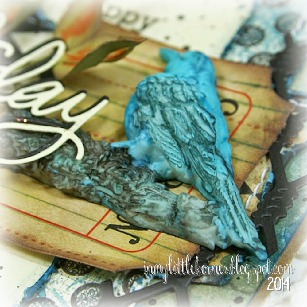
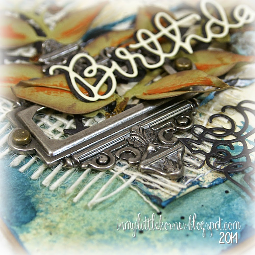
This time, I used some patterned papers over the painted background, accenting them with a piece of white burlap, one of my favorite wire dies, a torn piece of ticket, a metal bookplate, and some die cut leafy accents. There's another resin bird-on-a-branch, again colored with medium and dark blue, but this time accented with a dark sepia spray...


I used a combination of stamped words and a large die cut word for the sentiment...


Here's how the base piece looked before adding the papers and embellishments. This time, I used a light tan spray, added the medium green, then medium and deep blues...no orange in the background this time...


Supplies:
Patterned papers:   Authentique Enchanted collection
Sentiment stamp:  Winnie & Walter "The Big, The Bold, and The Happy"
Color mediums:   Lindy's Stamp Gang Flat Fabios (Danny Zuko's Denim,  Ocean Breeze Blue,  Merry Go Round Green,  South Shore Sand,  Sandra Dee Sepia)
Dies:   Simon Says Stamp "Happy Birthday";   La-LaLand Crafts "Diamond Wire" and "Berry Flourish" ;  
My Favorite Things "Four Corners Dienamics"
Resin Bird/Branch:   Prima            White burlap:   TheFunkieJunkie.com
Miscellaneous:   Tim Holtz Ticket and Ornate Bookplate;  Liquitex Ink!-Carbon Black;  Cinnamon stickles


Thanks for visiting today...have a wonderful weekend!


Friday, June 13, 2014

Happy Fathers Day, Take 2...

Happy Friday the 13th, everyone! I prefer to think of today as a "good luck" day instead of the traditional outlook...so I hope good luck follows you all day and night long.

To end the week, here's one last Father's Day card that could actually be used for any occasion requiring a masculine card, since the sentiment here is on a tag. I first saw the idea for the triptych-like map paper treatment on Pinterest a while back, but I didn't pin the project, just wrote "triptych map paper" on my ideas page in my little notebook. So I can't take credit for the idea, but now I can't find the original project or pinner to credit them here.

Once again, I used contrasting textures, along with deeper shades of teal, kraft and black, to give a masculine feel to the card. I ran the teal Kraft Core cardstock through a paper crimper, then sanded it to make the core show through the raised lines...


On top of the twine bow, I used a sprocket piece from a prepackaged embellishment set, and added a couple washer-like doodads (yep, that's what I call them. I don't know the proper names of most of the hardware I picked up in Home Depot years ago to use in my crafting. All I know is that I have lots of "doodads" and "thingies" in my crafting hardware drawers LOL). I used Glossy Accents in the centers to make sure all three pieces were secure, then added a tiny bit of teal craft paint in the center to blend it all with the rest of the card...


Scattered around the card is some Aged Silver Frantage embossing powder...


These large berries on the stem were purple when I purchased them...a coat of teal craft paint made them the perfect match on this card...


Supplies:
Papers:   DCWV (burlap paper);   7Gypsies (map paper);   Tim Holtz Kraft Core/Coredinations (teal)
Sprocket:   Hobby Lobby/The Paper Studio           Berry branch:   Petaloo
Embossing powder:   Stampendous Frantage          Miscellaneous:   twine, silver hardware


Thanks so much for visiting today...have a wonderful weekend!


Monday, June 9, 2014

LOTV-Happy Father's Day...

Happy Monday, all! This week will be watercolor and mixed media week here on the blog, so be prepared for a few more cards that stray from my usual style a bit. Of course, when we come to the mixed media portion of the show, my usual "everything but the kitchen sink" style of embellishments will be clearly visible to you. :)

Today's card is a masculine card, combining a couple Lili of the Valley stamps and watercoloring with Distress Inks. Because the piece turned out so detailed, I went with a CAS (clean and simple) style for the card.  I used LOTV's  Set 53, Vintage Backgrounds (I used the same stamp as shown in Elise's sample on the product page), only I did some "selective inking" to mask off the dragonfly and the cherub. Then I stamped a couple of the clocks from Set 66, Grunge Elements, and added the key and French text from that same set to fill in some of the blank space between the clocks.


I used liquid frisket to mask off the clocks and the scrollwork at the top of the piece, and after wetting the whole piece of watercolor paper, started laying in colors using Distress Inks. I let the colors drift where they would, and when it was done, I looked at it across the table and realized it came out looking a bit like a vintage map, with the blue waters and brown and green land masses.You never know what you'll get when you just let things happen on their own!

After the watercolor paper (I used 140 lb cold pressed) had dried, I sprinkled it with Vintage White Frantage embossing powder...


I pulled out a metal cog, and before tying it with the twine, coated it with more of the Frantage embossing powders (I mixed Vintage White and Vintage Gold on it), added a tag printed on my computer, and it was done!...


Supplies:
Stamps:  LOTV Set 53/Vintage Backgrounds, and Set 66/Grunge Elements
Die:   Impression Obsession Mini Rectangle Tags 2
Metal cog:   Hobby Lobby/The Paper Studio          Stampendous Frantage Embossing Powders
Ranger Distress Inks (Peacock Feathers, Crushed Olive, Rusty Hinge, Vintage Photo)
Miscellaneous:   twines


Thanks for stopping by for a visit...I hope your week starts with a smile!

Monday, June 2, 2014

LOTV - Because You're Special...

Happy Monday, everyone...hope your weekend was a fun one. Summer's in full swing around here...high temps, and allergies in full swing...wheeeeeee! :)

Father's Day is just around the corner, so I'm going to feature a few more masculine cards for a bit (but there will still be some girly, feminine, shabby-chic cards, too).  For today's card, I used some pieces of patterned papers left from previous projects, and because there's no image, I used some textural elements to embellish the sentiment pieces in the center. It's made in deeper tones, using papers from LOTV's Beach Bliss pad (light tan squares), and Father Knows Best pad (all other papers), with some shabby mixed-media touches...


The clock is stamped onto watercolor paper using LOTV's Set 66, Grunge Elements - it was watercolored with Distress Inks.  In the center, I stamped the sentiment using Set 29, Vintage Sentiments/Just to Say, diecut it with a circle die, watercolored with more Distress Inks, and popped it up with foam tape. I used a selection of tiny watch parts beneath the clock...Glossy Accents worked perfectly to adhere these tiny elements down securely...


Instead of my usual embellishments of flowers and pearls, this time I used die cuts of  branches, Chloe stems, and leaves, and added a tiny bit of white craft paint to distress them and the twine...


Supplies:
Patterned Papers:   LOTV Beach Bliss and Father Knows Best
Stamps:   LOTV Set 29, Vintage Sentiments/Just to Say and Set 66, Grunge Elements
Dies:   Impression Obsession Bare Branch;   Memory Box Chloe Stem;   Sizzix Flowers Branches & Leaves;   
Spellbinders Standard Circles Large and Small
Stencil:   Tim Holtz Chevron
Miscellaneous:   watch parts, cheesecloth, modeling paste, twine, Distress Inks


And one last note of interest for today...


Lili of the Valley is running a 3-for-2 Special Offer on the website that runs from today through noon (UK time) on Friday on select image stamps and art pads...there are lots to choose from, so please check it out!


Thanks so much for stopping by...I hope your week started with a smile!


Thursday, December 5, 2013

One Last Autumn Card...

I have one last autumn birthday card to share with you before I dive head-first into the Christmas season. :)

This is a masculine card, so I couldn't really use the flowers and feminine touches that seem so natural for me to use. This time I went with a leaf theme, with burlap, cheesecloth, hemp cording, shabby embossing powders, and multi-layered pieces, to give a textured and festive look. A little dry-brushing of white craft paint around the dark brown edges, and the green die cut edge around the orange frame, brighten up the card a bit and give it a worn and shabby, but still masculine, look...


Since I had a large digi image in the center, I decided to place my embellishments in opposing corners, top and bottom. On the bottom cluster, there's one large punched leaf edged with bronze glass glitter. Beneath it is a scrunched piece of cheesecloth, and a few thin strips of partially unraveled burlap. There's a double-loop hemp cording bow, three threaded buttons, and a few bronze and grey pearls holding the end of the sentiment banner.

Here's a little hint to keep your burlap strips from unraveling more after you've gotten the final look you want...use some clear liquid glue (or, if you're a sewer and have some handy, Dritz Fray-Check) and coat the ends to glue them in place. The glue will be invisible when it dries, and the ends will keep that perfectly unraveled look you worked so hard to get. :)


I like to "shape" my sentiment banners over a rounded pen (or any other round object I can quickly grab as I'm working along). Place the center of the banner over the pen and use your fingers to lightly shape the little bump in the center, then wrap the end of the banner in the opposite direction around the pen to make the end bend upwards...


Up in the top right corner is another smaller cluster, with the shabby unraveled burlap strips beneath the punched and glittered leaves...


I used lots of layers and foam tape on this card. The brown embossed cardstock layer is raised up from the green layer with foam tape. The green layer is raised up from the digi collage picture using foam tape. And finally, the orange die cut frame is raised from the green cardstock layer using foam tape. I love the dimensional and shadowed look that the use of foam tape can add to an otherwise "flat" card - I buy it 2-3 rolls at a time so I'm never without it in my stash...


Supplies:
Dies:   Spellbinders Labels 22
Embossing folder:   Cuttlebug Kassies Brocade          Leaf Punch:   Marvy Uchida
Silver & gold pearls:   Creative Imaginations 
Embossing powders:   Stampendous Frantage Vintage Silver, and Vintage Gold
Miscellaneous:   bronze glass glitter, burlap, cheesecloth, hemp cording, white craft paint
Digital collage elements:   Music paper background:  FreeVintageDigiStamps.blogspot.com;   fall leaves:  TuckDB.org


Thanks so much for visiting today. I'm off to visit with my Mom again tomorrow, then back home this weekend where I hope to get the big Christmas tree up and decorated...wish me luck! :)


Wednesday, October 2, 2013

A Little Change is Good...

Today's card is a little change of pace for me...no flowers and lace here...because today's card is another masculine birthday card.

I was playing around with the pad of burlap paper that I mentioned a couple posts back, trying to determine what would cut well with it and what wouldn't.  I decided to play with Spellbinders' Grateful Lattice die, and had a go at trying to cut the burlap paper with it.  It did cut, but not without many, many passes through the machine, adding a shim here and there. I kept all the little "inside" pieces, thinking I'd come up with some fun way to use them sooner or later.

When I had determined the colors I wanted to use for this card, I remembered those little shaped burlap pieces, and they actually helped decide the overall design of the card for me...


I cut another full lattice piece from cream cardstock for the front of the card, and decided to cut part of it away to make room to stamp a birthday sentiment.  Then I took some of those little burlap pieces from my burlap lattice, and popped them up with foam tape inside the cream cardstock in a fun and random placement...


In the center of the card, I used some metal embellishments, twine, cheesecloth, a cardstock flourish, and some dark pewter beads in a cluster...


And the piece of the cardstock lattice I cut off the front?  I decided to use it on the inside of the card, and glued the burlap pieces down flat inside the lattice, instead of popping them up with foam tape...


Supplies:
Dies:   Spellbinders Grateful Lattice and Foliage Two;   Memory Box Elegant Scrollwork
Sentiment stamp and metal gear:   The Paper Studio          Metal keyhole:   Tim Holtz Ideaology
Pewter pearls:   Creative Imaginations          Metal key:   local craft store          Burlap paper:   DCWV


Thanks so much for visiting today!


Friday, August 23, 2013

Happy (Shabby) Birthday, Sir...

Happy Friday!  After a lengthy post the other day, today I have a short and sweet one.

It was time for me to make another masculine birthday card...and time for me to come up with something new other than the digital collages I've been using for them. :)  It was also time to break from my blue/brown and green/brown combos that I usually seem to put together for these types of cards.

So today I'm sharing a shabby card that's still masculine...burgundy and cream, with metallic accents...there's a leafy pattern on the top paper, so I added a couple cream leafy branches around the center collage...


After unraveling the edges a bit, I scrunched a small piece of burlap with a running stitch through the center, and glued it down in a random pattern...then added some sprockets and spinners on top...


The sentiment tag sits inside a memo pin, and a small piece of film tape ribbon peeks out behind the burlap...


Supplies:
Patterned papers:   Prima Botanical collection
Spinners, sprockets, film ribbon, memo pin:   Tim Holtz
Copper gems:   Queen & Co.          Dies:  Spellbinders Foliage Two
Miscellaneous:   cheesecloth, burlap


Thanks for visiting today...have a great weekend!


Wednesday, July 10, 2013

A Masculine Card Filled with Texture...

I've mentioned before the trouble I have making masculine cards...they fall outside my usual style loaded with frilly embellishments.  And try as I might, clean and simple is hard for me to pull off...one of the reasons I so admire those who make such beautiful CAS cards.

So when asked to make a masculine card, I made sure my friend knew of this, so she would be extra patient with me as I threw ideas her way. :)  My friend decided this card, with the deeper masculine colors, and loaded with texture, was the one she wanted...


The large "pocket" loaded with burlap, cheesecloth, patterned paper pieces, and corrugated cardboard is anchored at the top with a large dual toned button laced with burlap twine...


At the other end of the pocket, the sentiment is stamped and sits inside a large metal decorative plate...


At the top of the patterned papers and cardboard inside the pocket is a black metal clip adorned with a tiny key tied on with burlap twine...


Supplies:
Patterned papers:   Authentique Gathering collection
Tim Holtz Ornate Plate          Hug Snug seam binding          Creative Imaginations pewter gems
Sentiment stamp:   Hero Arts          7 Gypsies paper clip
Miscellaneous:   cheesecloth, burlap, corrugated cardboard, buttons, twine, key charm


Thanks for visiting today!


Wednesday, May 8, 2013

Happy Birthday, Mister...

If you've been keeping tabs on me for a while, you know my "natural" style of shabby with lots of flowers doesn't really work for everything. There are times when you want handcrafted cards for the men in your family who aren't impressed with those shabby floral arrangements. :)  So it takes a bit more thought and planning for me to come up with cards with more masculine themes and looks.

You might recognize the vintage auto graphic on today's card...I've used it before, but in a different way.  This time, I made the collage the size of the whole front of the card, changed the background papers, added a couple birds...well, see for yourself...


The color combo is a little unexpected...dark purple/blue, with leafy green, and kraft...the dark berry spray (which is labelled "blue" on the packaging) on the left side was the catalyst for this color combo, and I like how it turned out!  


I printed out two copies of the collage, hand cut the birds out of one, and matted them over the other collage with foam tape so they gave some dimension to the front.  A heavy coating of clear coarse glitter over the crown gives it some texture...


Since I knew just who this card was for, I went ahead and printed the sentiment onto the cream cardstock before stitching it to the inside mat and adhering it inside the card...


Supplies:
Berry spray:   Petaloo       Leaf pin:   Maya Road       Hug Snug seam binding
Digital Collage elements:
Torn paper background:   PlayingWithBrushes on Flickr
Background paper:   Carina Gardner Curio 7
Music sheet, vintage auto:   FreeVintageDigiStamps.blogspot.com
Chocolate label, sitting blue bird:   TheGraphicsFairy.com
Florals:   VintageImages.org
Flying bird with note:   Bumblebutton,blogspot.com


Thanks for visiting today!

Related Posts Plugin for WordPress, Blogger...